Channel Feature
Behind the rebrand: Sainsbury Museum and Art Centre
12 November 2026
The Sainsbury Centre has become Sainsbury Museum and Art Centre – its original name as specified on the museum’s founding documents in 1973. The new name affirms the institution as a place of innovative museum practice, and as a dynamic international contemporary hub for living art.
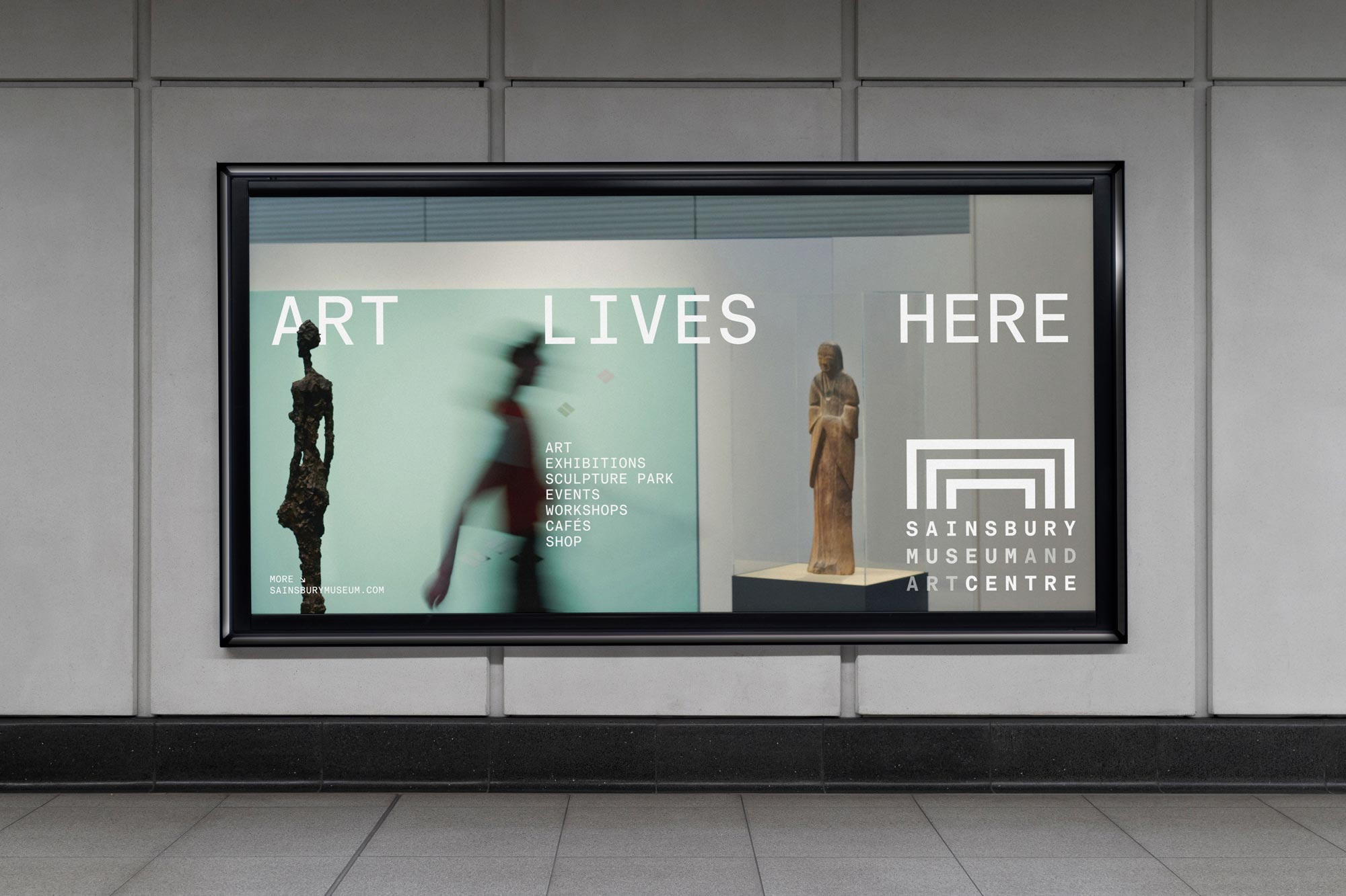
The Sainsbury Centre has become Sainsbury Museum and Art Centre – its original name as specified on the museum’s founding documents in 1973. The new name affirms the institution as a place of innovative museum practice, and as a dynamic international contemporary hub for living art.
The restoration of the institution’s original name highlights its two roles: as a Museum – preserving, researching, and displaying a permanent, world-class collection for public education – and as an Arts Centre: a catalyst which asks contemporary social questions with temporary exhibitions, creative workshops, an integrated arts landscape and live community events to foster active participation.
Together, the name change and rebrand are intrinsically linked to the history of the museum and to its current function as a home for Living Art, a concept launched in 2023 which treats all art as living, breathing entities rather than static historical objects. In Living Art, all artworks in the Sainsbury Museum and Art Centre are alive, and it is a home to 6000 years of life experience: a dynamic living landscape where it’s possible to meet materialisations of people and culture, of ideas and inspiration from all over the world.
Jago Cooper, Director of Sainsbury Museum and Art Centre, said: “The Sainsbury Museum and Art Centre is an art museum like no other – it is where art answers the biggest questions in our lives. The way we look after our collection is totally unique, as we respect every piece of artwork within our care as a living entity. Reverting back to the original name written in the museum’s founding deeds, this rebrand is intrinsically linked to this phenomenal museum’s history and identity. Our new brand and more descriptive name will help a whole new generation of visitors discover us.”
The name change for Sir Norman Foster’s architectural masterpiece coincides with a new, dynamic, architecture-led visual identity system and new messaging, developed with creative agency North Design, to clearly mark a bold new chapter.
One of Sir Norman Foster’s earliest sketches of Sainsbury Museum and Art Centre reveals his vision for the museum – the largest open-plan building in Britain at the time – as a three-dimensional space and a new home for art. The new brand mark, inspired by that sketch, sees the structure of the building form descend into letters of universal width to capture this sense of space and humanity, of place and people. The new brand is where 3D meets 4D and visitors meet artworks that are living representations of life throughout time.
The design process delved deep into the museum’s archives to extract Sir Norman Foster’s early structural sketches; and interrogated Otl Aicher’s foundational design ethos of “intelligent geometry” to ensure the brand was anchored in genuine architectural heritage.
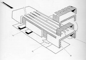
Concept sketch of the (then) Sainsbury Centre for Visual Arts by Norman Foster. Copyright The Norman Foster Foundation
Moving away from a static logo or symbol, those architectural study drawings were translated into a responsive spatial identity system, constructing a visual portal formed of nested, stepped geometric vector frames that directly mirror the physical rhythm of the iconic 150-metre steel space frame.
To support this visual language, North Design engineered a custom uniwidth typeface, SM Baumer Mono, testing and developing a dual-mode typographic engine that fluidly switches between a disciplined Functional Mode for administrative wayfinding and an Expressive/Living Mode that operates as a sculptural, spatial graphic element across layouts and digital environments.
The new colour strategy and layout logic is grounded in the building’s raw physical materials – aluminium, structural steel, glass, and concrete – paired with context-adaptive campaign palettes that shift dynamically in response to specific curatorial artwork and exhibition themes.
Sean Perkins, Director at North Design, said: “Building on the legacy of Norman Foster and Otl Aicher was an extraordinary privilege. Architecture and art of this caliber call for a visual identity created with equal rigor and restraint. Drawing directly from Foster’s iconic grid and the gallery’s vibrant collection, we created an identity that lives and breathes with the museum itself – dynamic, living, and radical across both print and digital.”
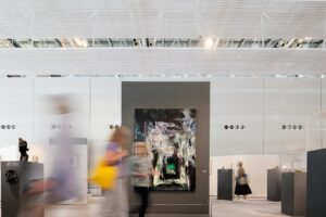
The Living Area. Photo by Lee Mawdsley